About the Project
Client: Ruth Hartley Mosley Womens Foundation
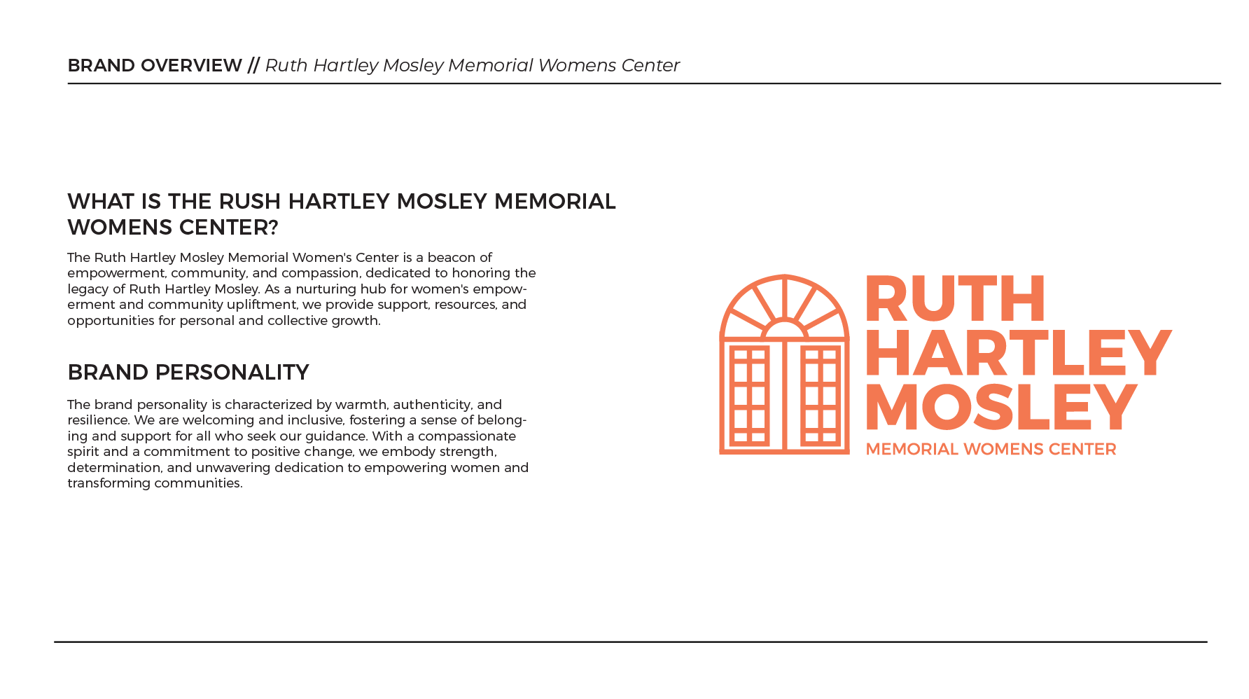
Business Name: The Ruth Hartley Mosley Center
The Ruth Hartley Mosley Memorial Women's Center is a beacon of empowerment, community, and compassion, dedicated to honoring the legacy of Ruth Hartley Mosley. As a nurturing hub for women's empowerment and community upliftment, we provide support, resources, and opportunities for personal and collective growth.
Client: Ruth Hartley Mosley Womens Foundation
Business Name: The Ruth Hartley Mosley Center
The Ruth Hartley Mosley Memorial Women's Center is a beacon of empowerment, community, and compassion, dedicated to honoring the legacy of Ruth Hartley Mosley. As a nurturing hub for women's empowerment and community upliftment, we provide support, resources, and opportunities for personal and collective growth.
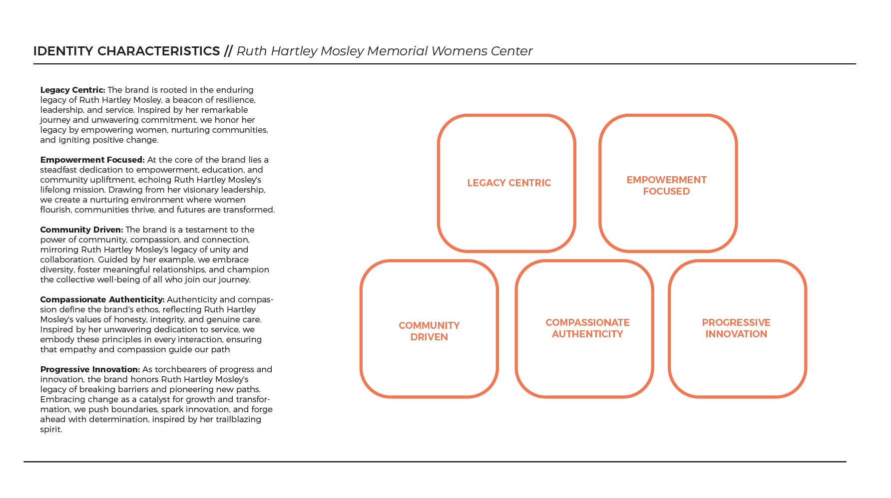
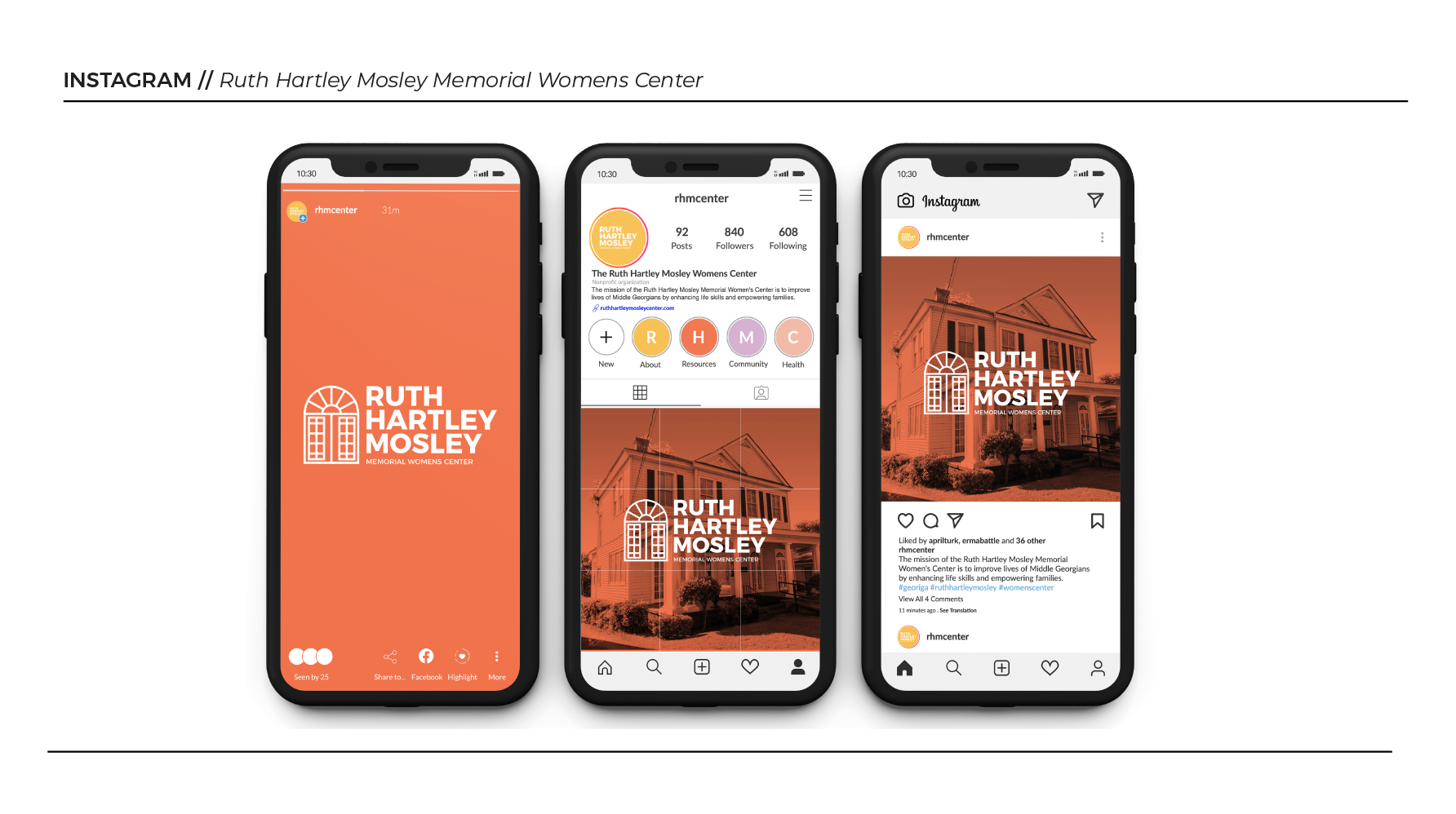
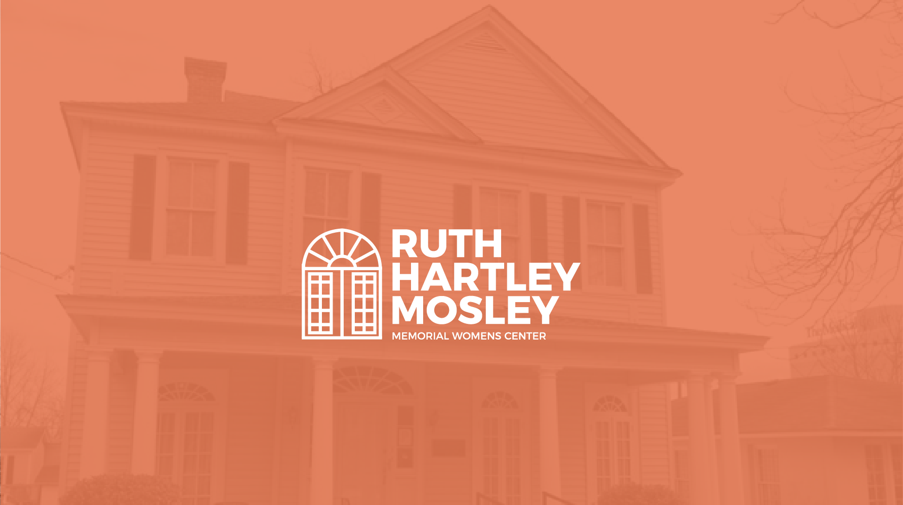
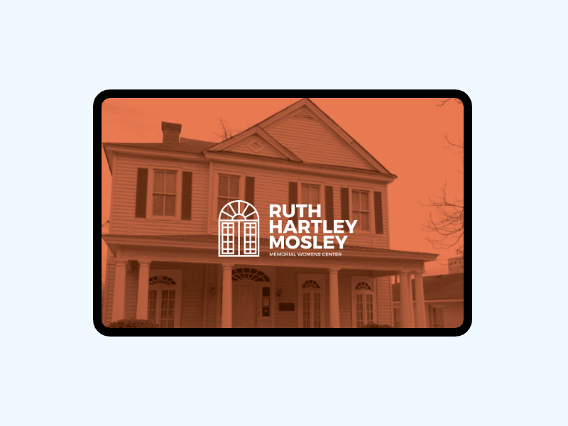
Brand Strategy
Collaborating with the Ruth Hartley Mosley Center, I led the development of a brand strategy that captured the essence of this esteemed community organization. Our goal was simple: to create a visual identity that truly reflects the center's dedication to empowerment, community, and compassion.
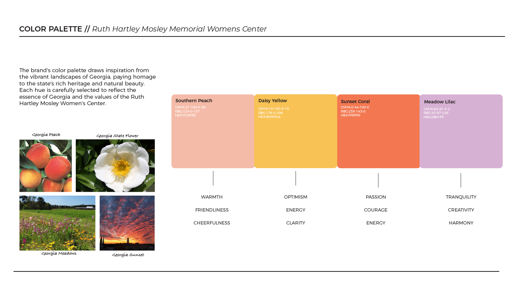
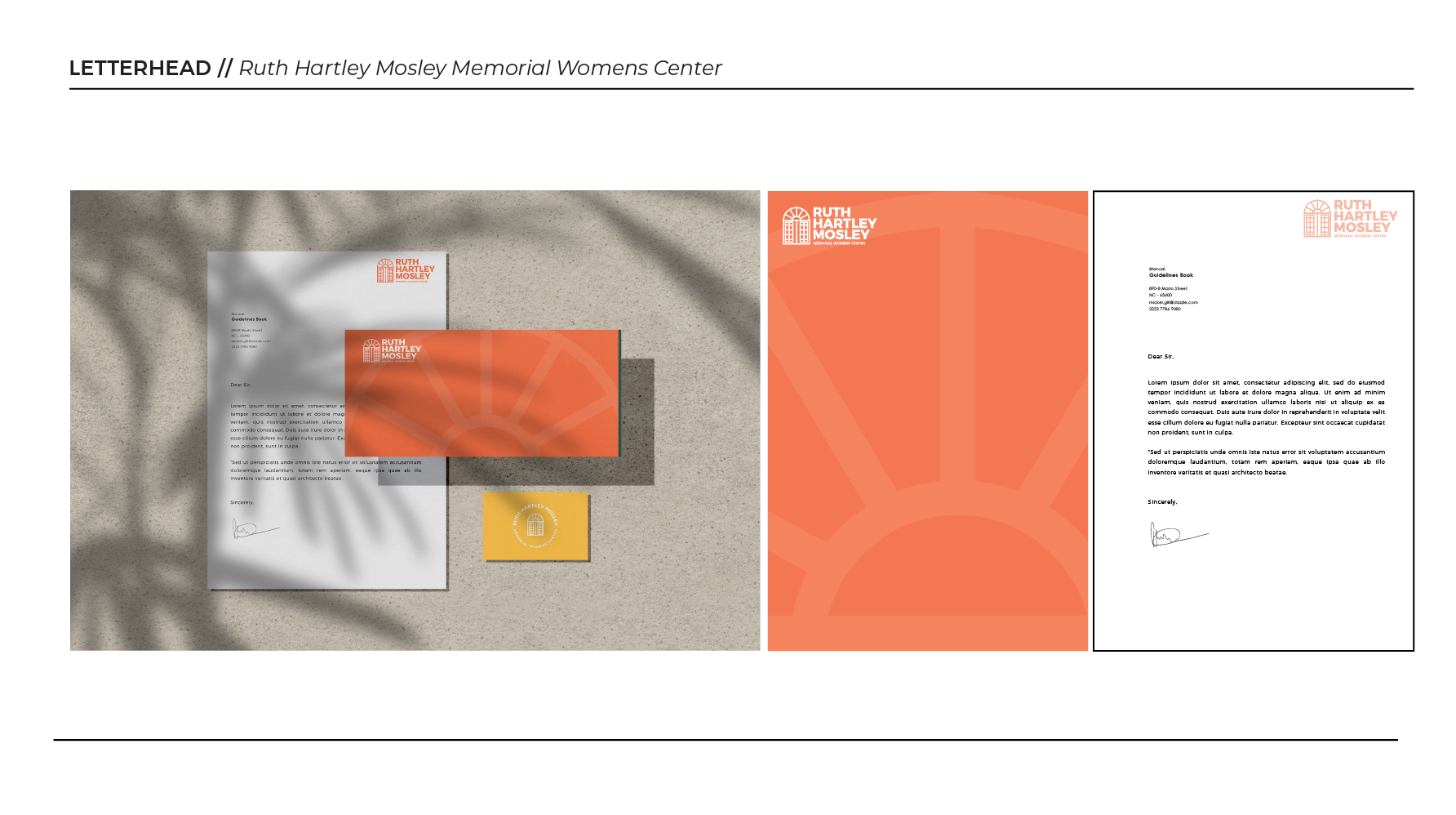
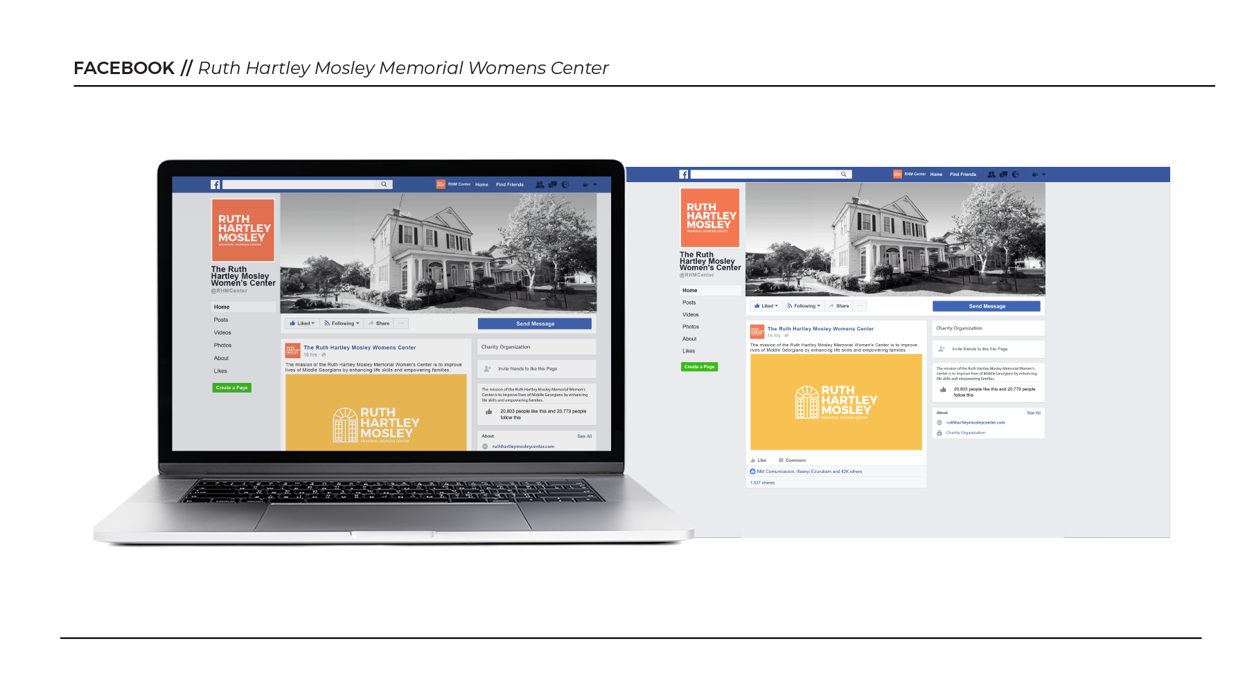
We chose a palette of vibrant peach, yellow, lilac, and coral to bring warmth and optimism to our designs, reflecting the center's inclusive spirit. These colors formed the basis of our brand identity, giving every element a sense of vibrancy and authenticity.
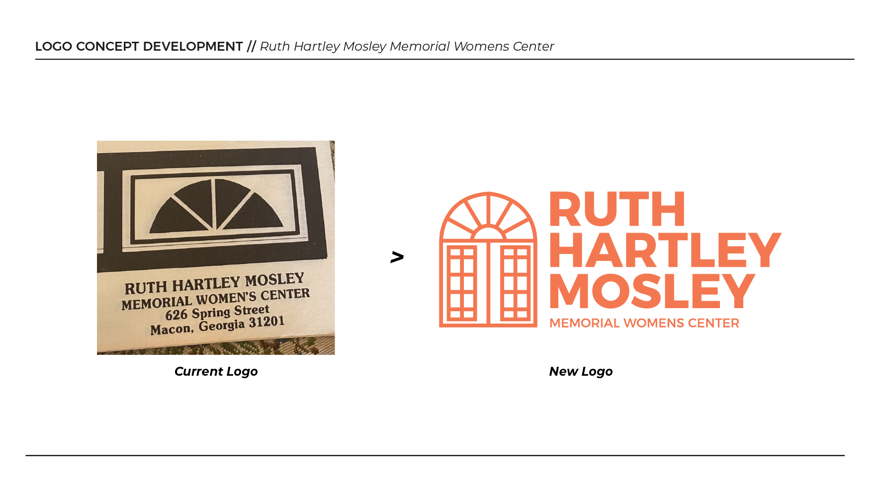
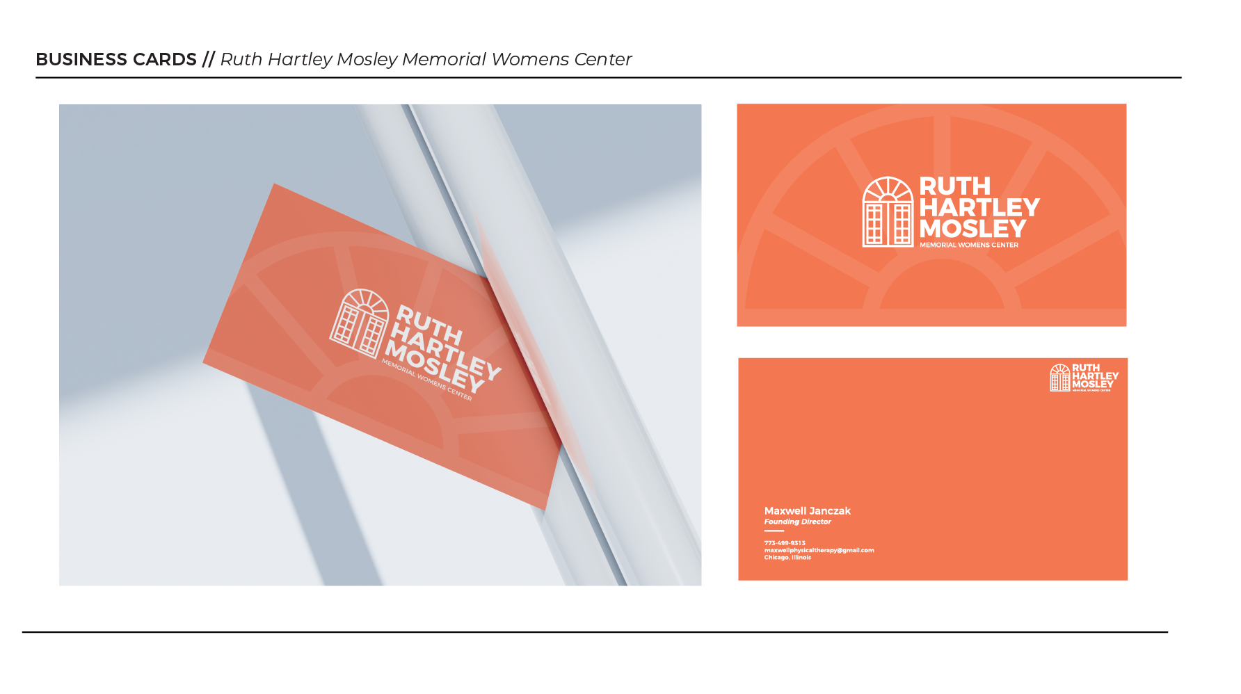
At the heart of our branding was the Ruth Hartley Mosley Center wordmark. With its clean lines and timeless typography, it became a symbol of empowerment and unity, reflecting the center's commitment to positive change.
We also introduced a secondary color scheme of classic black and white to add sophistication and contrast to our designs. This combination enhanced visual clarity and underscored the center's professionalism and excellence.
Our focus throughout the project was to create a cohesive brand narrative that honored Ruth Hartley Mosley's legacy while setting the stage for future growth and impact. By blending tradition with innovation, our branding efforts conveyed the center's enduring legacy and vision for a brighter, more inclusive future.